ALS Direct, 2016
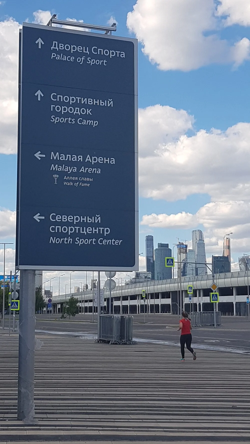
Direct typeface was designed by Vera Evstafieva specifically for wayfinding systems, with the special attention to Cyrillic.
At the time the project was initiated, Arial or very accidental typographic choices were common in the streets, parks and public spaces of Moscow and way finding design itself was in its early stage of development and appreciation, so ArtLebedev Studio set a goal to introduce a new typeface to serve way finding tasks.
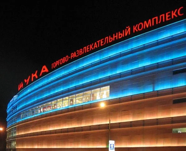
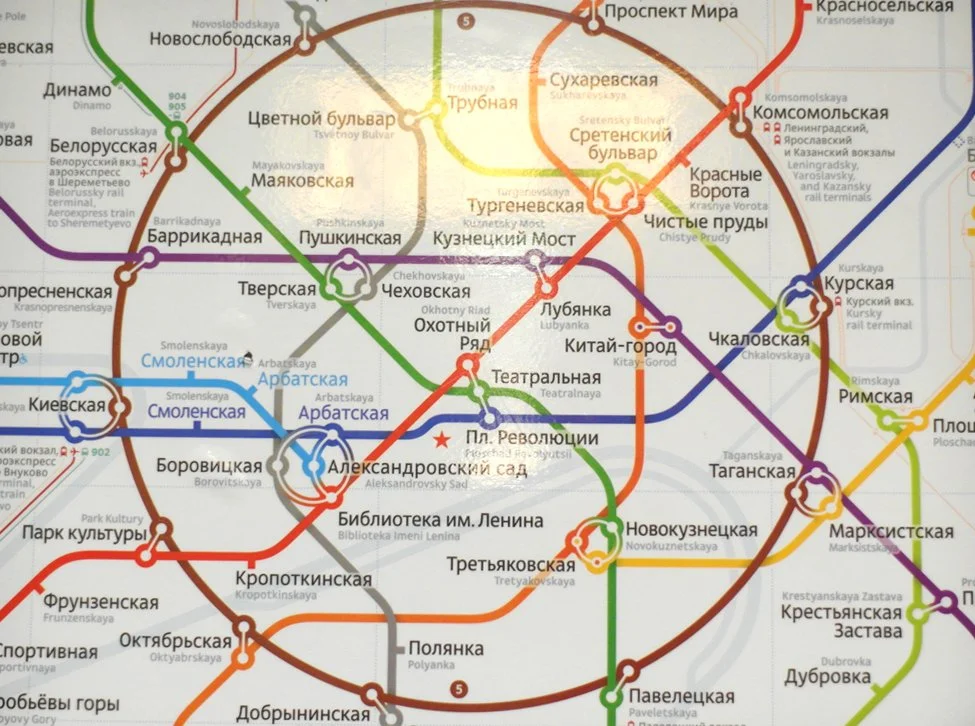
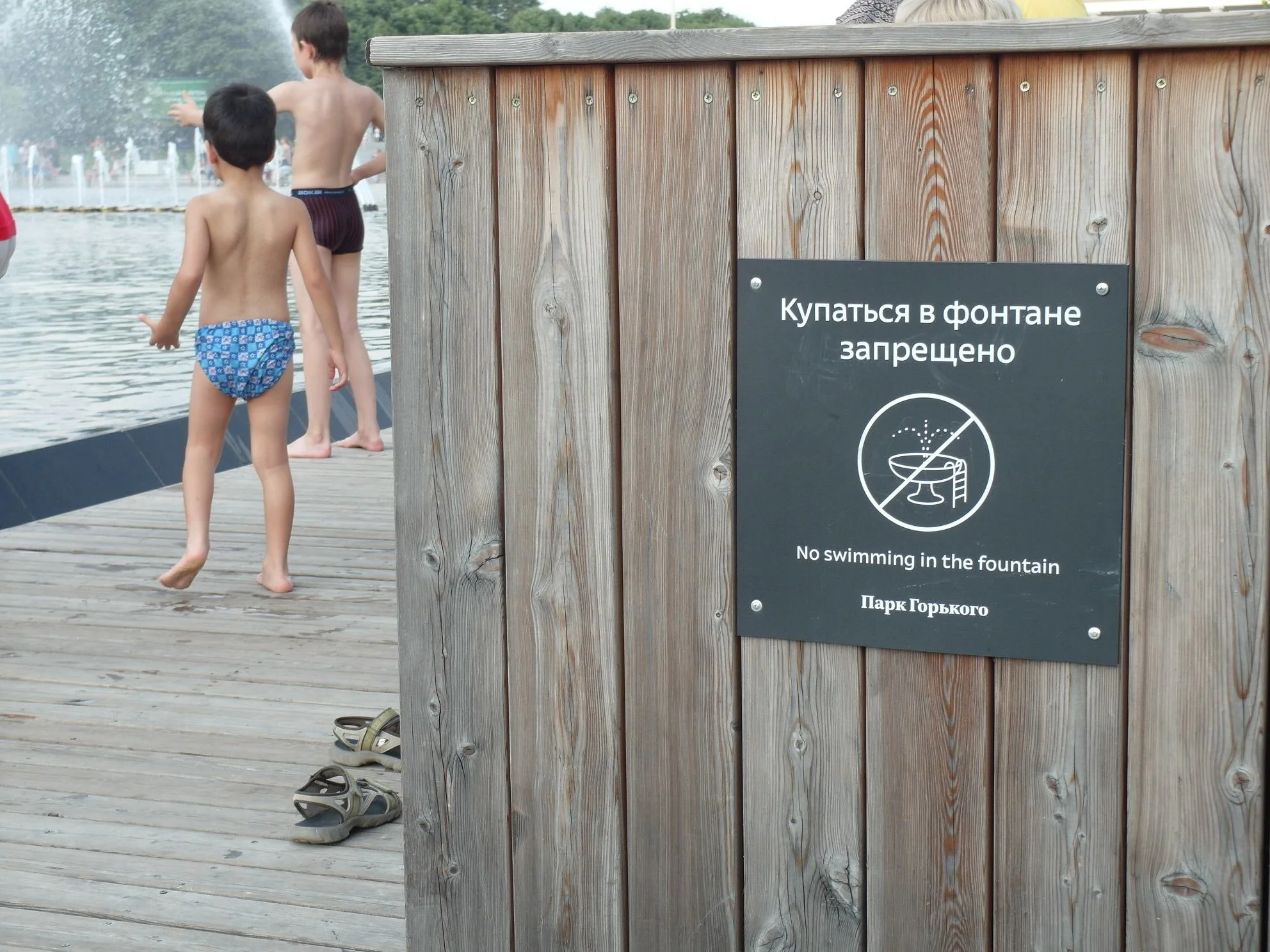
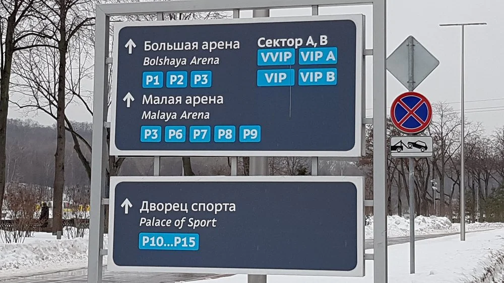
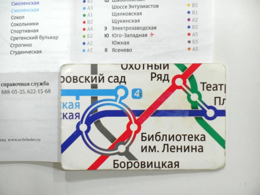
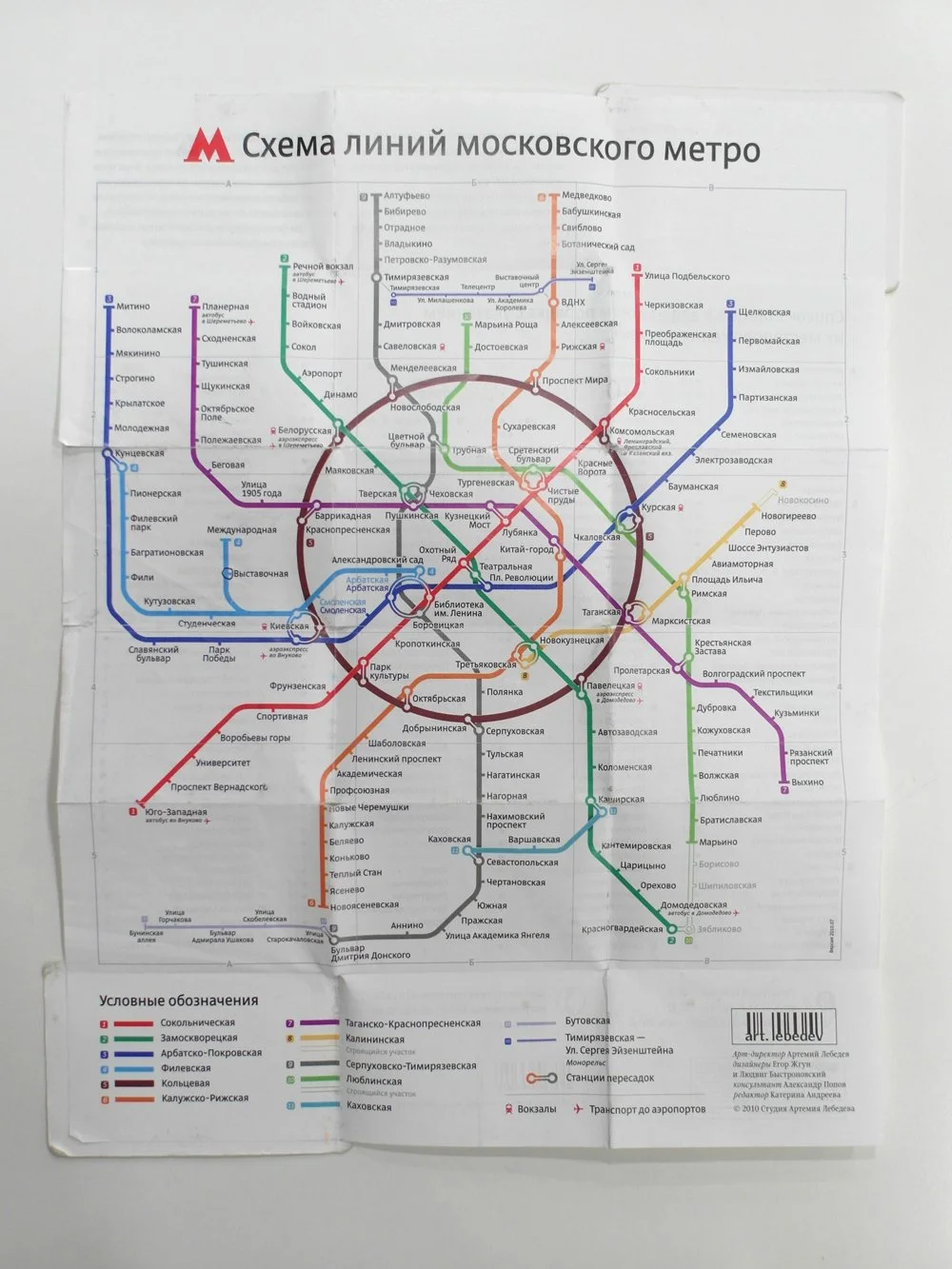
The first time it was used in a shopping mall Schuka, and later was chosen as main typeface for direction boards in Moscow. Direct is widely used for the purpose it was designed for. Among the public spaces it works in are Pulkovo airport in StPetersburg, Luzhniki Stadium and Zariadie museum in Moscow, and others. For a period of few years it was also the main font for Moscow underground map.
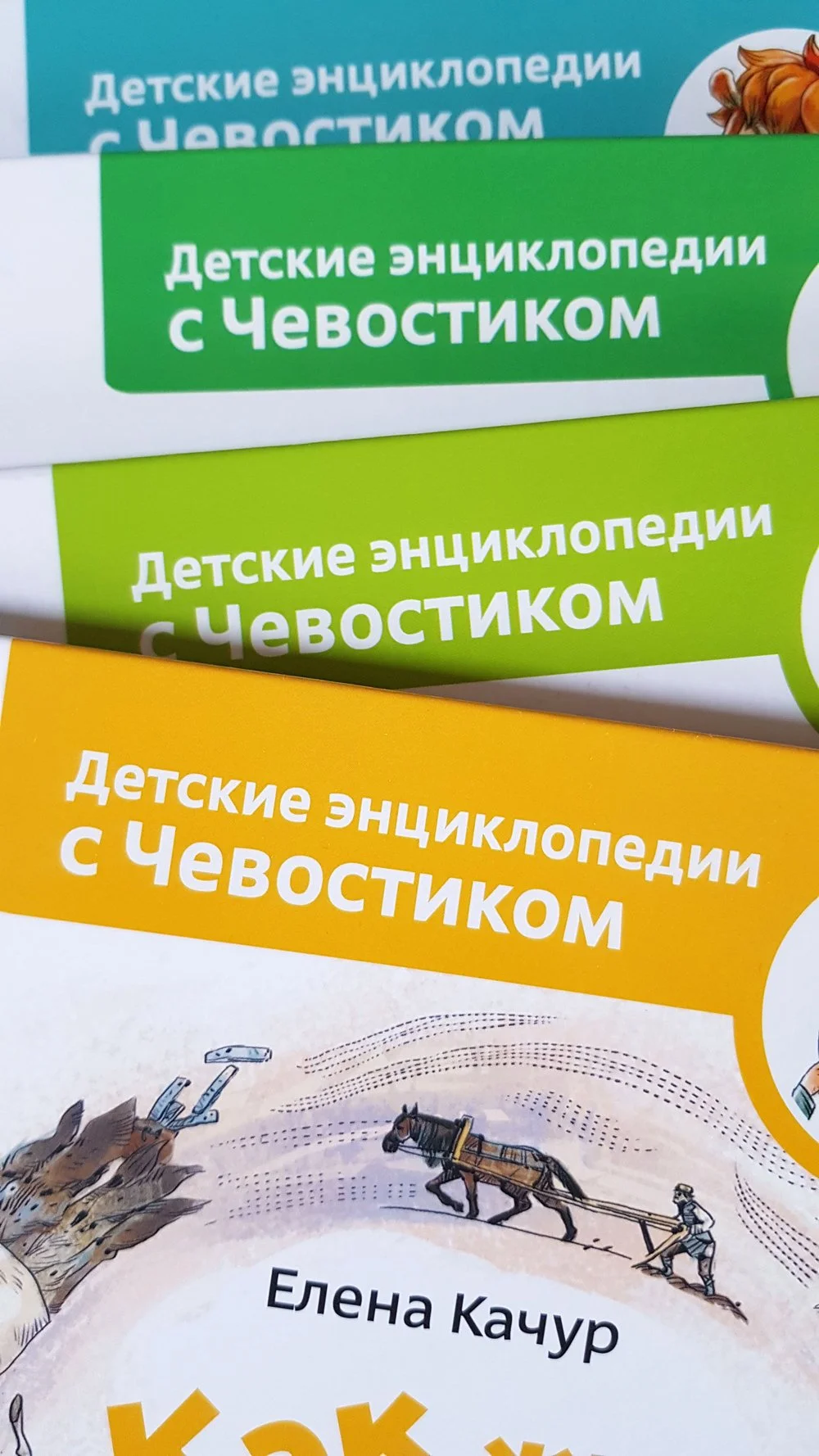
Additionally, Direct is used for a popular kids Chevostik encyclopedia as a text typeface, good for young readers as the letters have a large x-height, wide spacing and clear but catchy shapes.
It was also nice to find Direct in use on various websites.
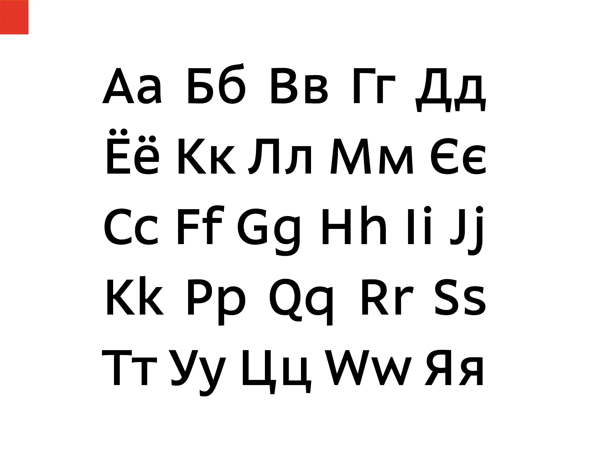


Direct is an open and dynamic typeface with clear-cut letterforms that make it instantly readable.
It’s pattern is neutral, yet smooth and modern.
Wide, simple and distinctive, sharp eye catching details.
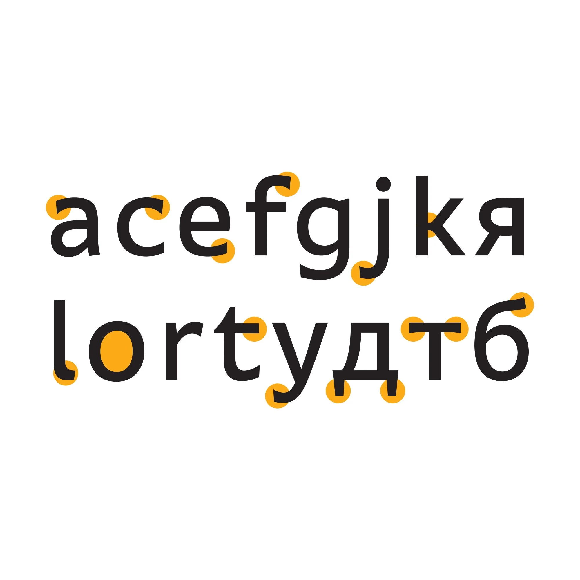
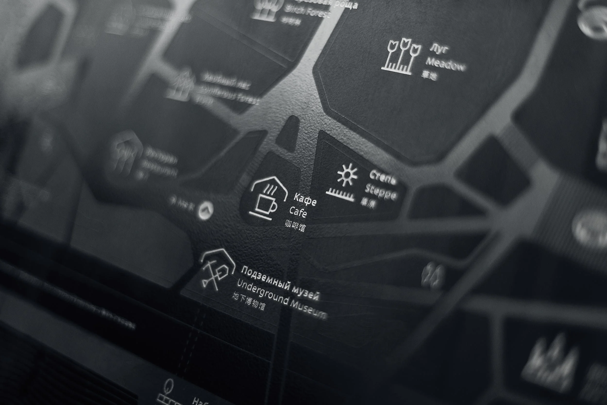
Direct typeface family includes nine fonts convenient for the purposes of way finding systems. Regular weight letterforms are rather wide, for direction signs are likely to appear in front of readers at an angle, so the type needs to withstand perspective distortions. And as signs and boards may vary in size, Direct was developed to include several width variations. Condensed styles can be used in horizontally limited spaces without sacrificing body size and readability.
Direct font in use